Admin
April 14, 2026
Choosing the right venetian plaster colours
is one of the most important decisions when designing a space with this
luxurious wall finish. Unlike standard paint, venetian plaster finish absorbs and reflects
light in a layered way, meaning the same colour can look completely different
depending on the room, lighting, and application technique.
Because of this unique
behaviour, venetian
plaster colours are not just decorative choices, they are design
tools that shape mood, depth, and atmosphere. A carefully selected shade can
make a small room feel larger, a dull space feel brighter, or a plain wall feel
like a sculpted architectural feature.
This guide explores how
to choose the right venetian
plaster colours, how lighting impacts them, and how to match shades
with different interior styles.
Venetian plaster colours
are created by mixing natural pigments into lime-based plaster. Unlike
traditional paint, the colour is embedded within the material itself rather
than sitting on top of it.
This creates:
●
Natural tonal variation across the
surface
●
Subtle depth and movement
●
A soft stone-like appearance
Each venetian plaster finish
reacts differently to light, meaning even a single colour can appear
multi-dimensional.
One of the biggest
differences between paint and venetian plaster colours is how they interact with light and
texture.
Because plaster is
applied in multiple layers, light penetrates and reflects at different depths,
creating a shifting visual effect.
Pigments are mixed into
the material, not applied on top, making colours feel richer and more organic.
Depending on whether the
venetian plaster finish
is matte, smooth, or burnished, the same colour can appear soft or highly
reflective.
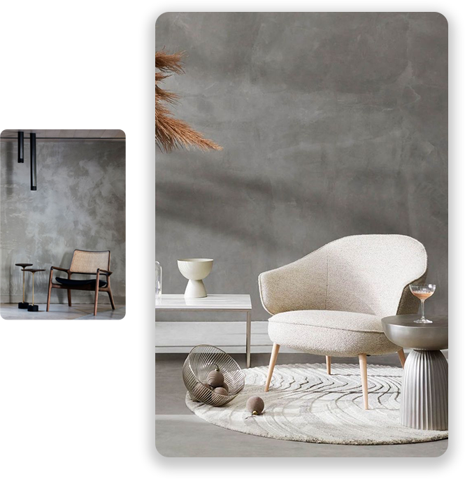
Neutral shades remain
the most widely used option because they are timeless and adaptable.
These tones create a
soft, welcoming atmosphere and work well in almost any room. They are
especially popular in living areas and hallways.
A modern favourite, soft
grey venetian plaster
colours suit minimalist and contemporary interiors. They pair well
with metal, glass, and wood.
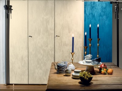
Off-white tones enhance
brightness and make spaces feel larger, especially in smaller rooms or
apartments.
Neutral venetian plaster colours
are ideal for homeowners who want elegance without strong visual dominance.
Warm shades create
comfort and emotional warmth within a space.
These earthy tones are
subtle yet rich, offering a grounded and natural feel.
Perfect for
Mediterranean-inspired interiors, these venetian plaster colours add character and
depth.
When used in polished
finishes, warm gold undertones create a luxurious glow under lighting.
Warm venetian plaster colours
are ideal for cosy living spaces and traditional interiors.
Cool tones are often
used in modern and architectural interiors.
These colours create a
calm and balanced environment, often used in bedrooms and offices.
Bold and dramatic, these
venetian plaster
colours are ideal for feature walls and high-end commercial spaces.
Subtle
industrial-inspired shades work well in urban lofts and contemporary homes.
Cool venetian plaster finish
styles often feel sleek and sophisticated.
For statement interiors,
bold colours create strong visual impact.
Rich green tones bring
nature indoors and pair beautifully with wood and brass accents.
These deep shades add
drama and luxury, often used in accent walls or boutique interiors.
A strong yet elegant
choice, perfect for high-end modern design schemes.
Bold venetian plaster colours
should be used carefully to avoid overwhelming a space.
Lighting has a major
impact on how venetian
plaster colours appear.
Natural light highlights
texture and depth, making colours appear softer and more dynamic.
Warm lighting enhances
beige, gold, and earthy tones, creating a cosy atmosphere.
Cool lighting
intensifies grey and blue tones, giving a more modern and crisp appearance.
Because of this, it is
essential to test venetian
plaster finish samples in different lighting conditions before final
application.
Best choices include
neutral or warm tones such as beige, soft grey, or sand. These create a
balanced and inviting environment.
Soft, calming shades
like pale grey, off-white, or dusty blue are ideal for relaxation.
Light, breathable venetian plaster colours
work best, especially when sealed for moisture protection.
Neutral tones or soft
warm shades complement natural materials like stone and wood.
Hotels, restaurants, and
offices often use darker or more dramatic venetian plaster finish colours to create
identity and atmosphere.
Current trends in venetian plaster colours
include:
●
Earthy, nature-inspired palettes
●
Soft minimal neutrals
●
Warm luxury tones with subtle
shine
●
Muted industrial greys
●
Organic stone-inspired shades
These trends reflect a
shift toward natural, calming, and timeless interiors.
Ignoring lighting
conditions can completely change how venetian plaster colours appear once applied.
Strong colours are
better suited for feature walls rather than full rooms.
Always test multiple
samples before final selection.
A colour that works in a
lounge may not suit a bedroom or workspace.
To maintain long-lasting
venetian plaster
colours:
●
Clean gently with a soft cloth
●
Avoid harsh chemicals
●
Apply protective wax when needed
●
Prevent surface scratches
Proper care ensures
colour depth remains consistent over time.
Selecting the right venetian plaster colours
is essential for creating a balanced and visually appealing interior. Because
each venetian plaster
finish reacts uniquely to light and texture, even small colour
decisions can significantly influence the final look of a space.
Whether you choose neutral
tones, warm earthy shades, or bold statement colours, the key is to match venetian plaster colours
with your lighting, room function, and overall design style. When done
correctly, it results in a timeless, elegant finish that elevates any interior
environment.